

[Unit 15 – Media, Contents & Package]
Date: November 2(Sat) 2019 19:00 - 20:00
Guest: Katsuo Mizuguchi(Unit 15 / Uniit Leader), Daisaku Kawase, Yasuharu Sasaki
Introduction: How has it created extra value in the world?
Mizuguchi: This is the third year I've worked as a judge, and this year I was the Unit Leader for the first time. I feel like I've finally been able to see the Good Design Award in its entirety. 44 items were awarded the Good Design Award from Unit 15. Today I'd like to talk about some of those that left an impression on me.
First, Mr. Sasaki, this year you've participated as a judge but you have worked as the Focus Issue Director from the first year, and I'd like to ask what were your overall impressions?
Sasaki: I was in charge of judging for the first time this year. I was originally a copywriter and now I'm a creative director at an advertising agency, where my job involves making various things, but I'm not a designer, so product design and graphics are not my specialty. As well as judging, I had the role of Focus Issue Director, and it was extremely difficult to search for common features in line with issues among the wide-ranging Good Design Award entries.
Overlooking it all, what I saw was that design is not just about appearance and how good something looks, but what's interesting about design is that it has the power to solve certain issues, and has the ability to create value which wasn't there before.
Mizuguchi: The Good Design Award as a whole covers an immensely wide range of areas, and this unit in particular judges an amazingly diverse selection that includes package design, font design, branding, contents, websites and apps, and it can't be said that there is a uniform criterion for the whole unit.
Package design is especially hard to evaluate. Beauty is not the only point for assessment, but whether it may have something in addition to that.
With contents as well, beauty is important, but so is whether it's creating some extra value for the world.
In terms of beauty, each judge has their own viewpoint and there is a standard for what is beautiful. This year, while each judge had his/her own stance, the subject of much discussion was whether each entry has the "power to resonate" like "this way of thinking will probably influence the world."
Sasaki: In my case, I looked at the brightness and originality of how a problem was solved. For example, if the issue was reducing garbage, I regarded the manner of solving that problem as an indicator of beauty.
With the "power to resonate," I think that there are various parties that it can resonate with.
Can it resonate with society, or if it's an environmental issue, can it resonate with the earth, or can it resonate with the person who uses it? I thought it would be good to choose something that could motivate people to move. For example, if someone used it, they'd tell their good friends about it and do it together. So I judged the entries from this viewpoint.
Digital Contents [NHK Reminiscence Library] (GOOD DESIGN BEST100)
Sasaki: This is a project that used old NHK archive video to get people to watch nostalgic footage and talk about their memories as a "way of reminiscing," in an attempt to slow down the progress of dementia. NHK took the initiative by using its abundant collection of old archive video to try and tackle a societal problem of this aging society.
Of course, NHK has been making and storing all kinds of content for many years. However, they were simply archiving it and couldn't reuse it, so they created this system as a way of reutilizing those archives. They turned it into content and distributed it to old people's homes all over the country. I think it's an interesting way of brilliantly solving an issue using methods and contents that are unique to NHK.
The company used its identity, assets and strengths in a really strong way, which I thought was truly excellent.
Station Space Design [Doraemon Sign, Noborito Station, Odakyu Line] (GOOD DESIGN BEST100)
Mizuguchi: At the Best 100 screening meeting, other judges said to me, "Aren't there lots of stations and trains that utilize cartoon characters?"
It's certainly true characters are used for other station signs and the context is the same, but it was highly rated for the way it was so well constrained.
Just by using the cartoon character Doraemon, desired results can't be achieved, so it was made while considering deeply how much to keep the iconic character Doraemon in check so that it fits in perfectly with the station's space.
The color control and other aspects were carefully calculated to such an extent that other stations that use characters, and stations considering using characters in the future, should use it as a reference in an endeavor to ensure it fits their station better, as it is such a good example.
Kawase: This time we were shown lots of things, and I thought many of them shared things in common, but I noticed there were various ways in which existing things were updated with new designs.
This is an example of that, as stations are basically places that pursue practical uses, they do not think much about implementing fun or exciting things like this. But this has been really well considered here, as there is not an excess of Doraemon that would make it like a theme park, but it has been properly and perfectly incorporated into the practical uses of the station.
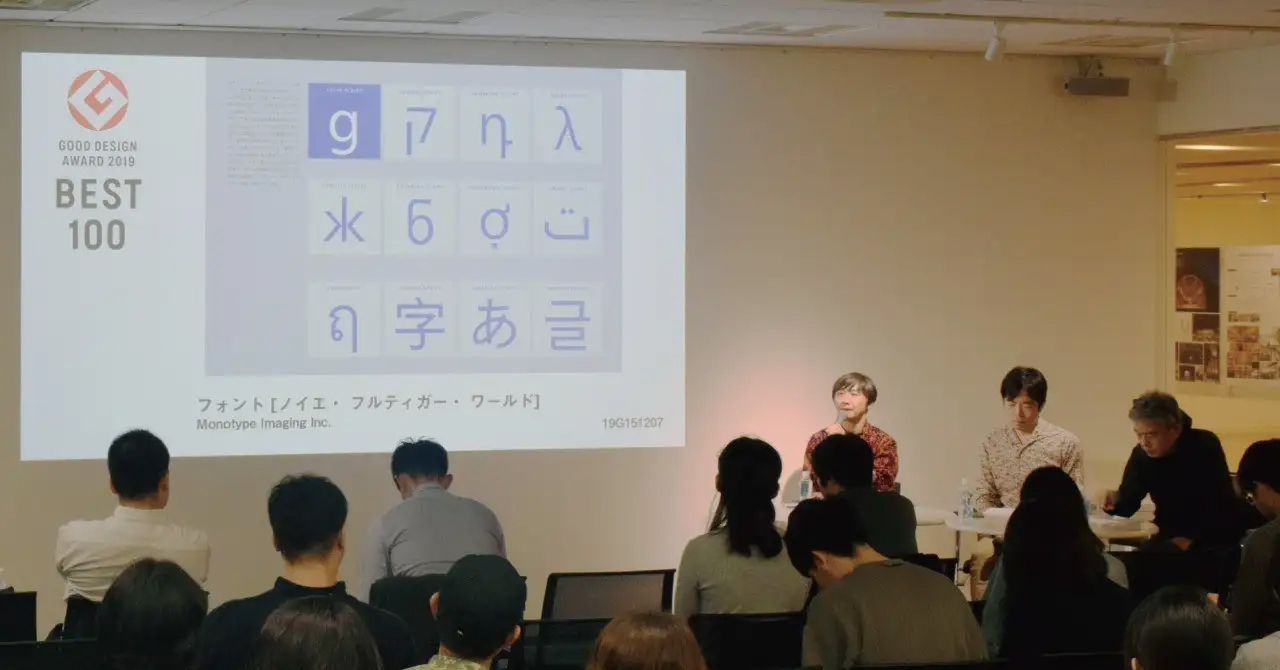
Font [Neue Frutiger World] (GOOD DESIGN BEST100)
Mizuguchi: This is an extremely famous font that is used for the signs at Narita Airport's Terminal 3 and the Hokuriku Shinkansen stations. Up to now it only had the basic alphabet variation, but now with "World" it can support the same font series for the languages of 150 countries around the world. Font designers from all over the globe, including Japanese designer Akira Kobayashi, came together to create it.
In this global environment, in an era where various people are in various countries, there had never been a uniform font up to now, and I think that it's a truly wonderful thing that it has now finally been accomplished, through designers overcoming their language barriers and cooperating together to create it. It was rated highly as I think it has the power to resonate, so its value is more than what would usually be derived from just the creation of a single font.
Sasaki: Innovation doesn't always involve the invention of something that has never been seen before. I feel the power of design also includes discovering a different value in something that we already have.
Food Package [Ganso Radium Tamago]
Mizuguchi: This involved the redesign of an existing package design for a souvenir from a hot spring in Fukushima prefecture. However, they've hardly changed it at all. Even though it's hardly changed, it's been updated a little so that current customers think it looks cute. I think this is good.
It's a good example of not having to change something for the sake of it, but if the original product is good, just altering it slightly so that it fits in with the present time. It's wonderful that the designer has properly incorporated the good aspects of the original item into the re-edited design.
書Book [50 experiences in nature to channel your primitive powers] (GOOD DESIGN BEST100)
Sasaki: This is not so much a book design, but rather more of an experience design, as it introduces various perspectives on how to interact with nature, which was a great idea.
People living in cities don't have much contact with nature, and while there's lots of information about nature in a study context in the form of textbooks, this project allows 50 experts with different perspectives, such as art, entertainment and science to introduce their specific experiences of nature from their own viewpoints.
You might think these contents would be suitable for a modern smartphone, but as you might not get a signal if you're in the mountains or out and about in nature, in actuality a book is the most suitable form, and this feeling of circling back around seemed fresh. By going to the trouble of using the old format of a book, they are actually optimizing the experience. I think it's interesting that they chose a book, so that you can flick through and randomly browse the experiences.
Mizuguchi: These contents were originally on the Casio website, and when you think of Casio, you think of G-Shock, and I heard that G-Shock products had the general message of "let's wear a G-Shock and go outside more to see the great outdoors."
As a company, this seems a wonderful way of promoting product experiences, by properly accumulating them together and turning them into a book.
This is a successful example of channeling your primitive powers, but this method of using collective intelligence to make a thing for someone or something is one that can be imitated by anybody to help solve the social issues that we face today, and so I think it has the power to resonate.
Commercial complex [FLIGHT OF DREAMS]
Kawase: Airports are facilities that are usually strictly for practical uses, but this is a good idea that uses the power of various technologies to turn them into fun places. It makes use of technologies that are only available now, including projection mapping, to maximize the exciting feeling you have when you go to an airport.
It's the same as the Unko Museum, and while it has things that are the same as before, it makes you think, "Oh, there was this way of advancing it even more!" which makes it very current. When judging contents and entertainment, I tend to be easily attracted by entries that raise the question of "why now?" in my mind.
SNS [HOT PEPPER Beauty cosme]
Sasaki: This is an app for online reviews for cosmetics. This has lots of applications and points of appeal like "it has new functions" and "its appearance is easy to use," but it was highly rated because it was carefully designed with the user's perspective in mind.
When choosing cosmetics, it's not simply the case that popular products are the best, but other factors are also important, such as whether it suits your skin or not, and whether the latest fashions suit you, and it's wonderful that they have properly considered these features and the user journey in the design.
Kawase: It's also a very stoic approach as it has abandoned advertising to ensure no bias creeps in. They have truly thoroughly carried out their philosophy of making it so that users can use it.
Conclusion: Are these new designs that fit this day and age?
Mizuguchi: I think the quality that the Good Design Best 100 award winners shared in common was the way that they updated an existing thing, or edited something in a different way, and fitted it in with modern times from that perspective. They were chosen by closely examining how well they were able to fit in with the current world.
The judging committee consisted of architects, product designers, business designers, etc., with various viewpoints, but when it came to what value they were looking for, I felt whether it was a new design that fitted this day and age was extremely important, rather than simply whether something was beautiful.
Sasaki: This is an age with a wide variety of technology, where everyone has a smartphone, and you can even create any function if you put your mind to it. In such an era, what is important for creativity and design is not trying to cram in as much stuff as possible, but to think of a simple and exciting experience with a story that is easy to understand. Carefully considering the user's experience from the beginning to the end, and making it as simple as possible, is the kind of design that I think suits this modern age best.
Kawase: What interests me is what Mr. Sasaki said, but I'd like to put it from a slightly different angle. In this age full of difficult issues, I feel the role that design should play has become even bigger, as the power of design can be used to solve problems brilliantly. I thought that there were lots of examples of that, looking at the chosen items, during this time when we often feel caught between a rock and a hard place. I feel it is precisely those designs that have the power to resonate and will become beautiful things.